Around the same time when “Web 2.0” became (in)famous, there was also the uprising of widgets and gadgets. Meaningless clutter on your desktop/homepage, supposedly to give you “at-a-glance” information about subjects you like (the weather in a country thousands of miles from your location, a largely oversized clock, news tickers, …). This is a trend that continues to grow, as more and more application go for a “widget”-style display.
So, am I the only one that seriously dislikes this?
When I first saw the screenshots of a Windows Vista desktop, I disliked it. It may have had its improvements graphic-wise, and it may have looked really slick, but the default menu & sidebar were a big no-no for me.
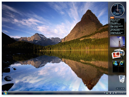
Take a look at the screenshot above. You’ve just lost a big portion of your screen, to a bloated sidebar, filled with information you don’t need. See that big-ass clock in the top right corner? Guess what; there’s already a clock in the bottom right one. It’s been there for at least 10 years.
Those rotating pictures in the sidebar. Do you _really_ need it? You can’t live for a day without having seen at least hundreds of your vacation pictures? It’s a useless feature, and you’re better of removing it – if only to remove a form of distraction that’ll keep you from your what you should be doing – being productive!
And to that extent, Windows Vista managed to sneak in extremely large desktop icons. I liked the size in Windows XP, why couldn’t they just keep it like that, by default? Your desktop looks cluttered if you have more than 10 icons, where this never was an issue before.
But no worries – they’ll get it right with Windows 7. I mean, they have to. Right?
Guess again.
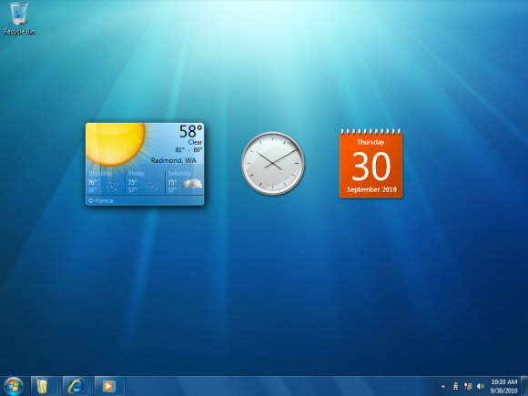
“We removed the sidebar to make room for … gadgets!".
This brings me to my original point: gadgets or widgets are a step back in productivity. They fill up your desktop, makes it look unorganized and distracts you from whatever it is you should be doing. They may have tried to make it look better, but at what cost?
A desktop should be kept for your most used application icons, not for duplicate information (2 clocks, really?). A clean, well-organized desktop is a true haven for productivity. You know every icon by heart, every position. You know where to click. You have your workspace just the way you like it.
Don’t spoil it with Gadgets/Widgets. Just don’t. I’ll stick to my Windows XP with Windows 2000 look for a while, as long as this “evolution” of gadgets continues.

