I have something to admit: I’m a bit obsessive when it comes to fonts.
Nobody notices it, but this blog has changed more fonts in the last 6 months than I care to remember. Chaparral-Pro, Open Sans, HelveticaNeue-Light, … they’ve all been used.
For me, a proper font makes or breaks a reading experience. In fact, I can still remember when just a few hours before launching our corporate website , I mentioned this “cool font I just came across” to Chris , and we decided to switch to HelveticaNeue-Light for the site, last minute.
Even our animated video got a font-change because of my obsessiveness. All for the better, of course.
So as much as the internet is about fonts and typography, kerning and whitespace, it sort of surprises me that the e-book world isn’t. Or maybe it is, but it’s only for the newer generation Ebooks.
I’m at my second Kindle now and I’d buy one again in a heartbeat . It’s absolutely brilliant. But after a few years, you begin to notice the outdatedness of the device. It looks and feels old. To me, that’s in large part because of the default font Caecilia.
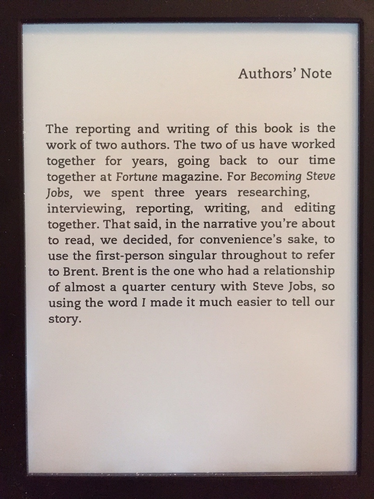
Here’s what it looks like.

It looks bold and makes the device feel older than it really is.
On the Kindle, I’ve used that font for many years. Largely because I had no idea that I could change the font in the first place. But it’s readable and there really isn’t much bad about it. It gets the job done.
Here’s what it looks like on the Kindle itself, as the cover page of Becoming Steve Jobs .

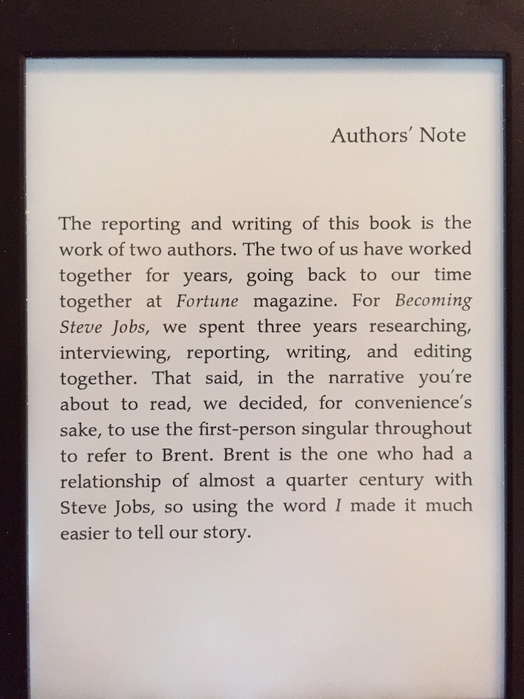
A very quick way of making the Kindle feel new again is by changing to the other built-in fonts, more specifically Palatino.

It’s more in line with modern typography as seen on the web: a lighter font that vaguely resembles HelveticaNeue.
But the default font options are limited. There are 6 included in my Paperwhite. And because geeks will be geeks, I wanted a font I choose.
First, make sure you’re on the 5.3.1 version. I’ve read some blogposts about alternative methods working on 5.3.1+ versions, but none of them seemed to work for me. Download the 5.3.1 binary image here .
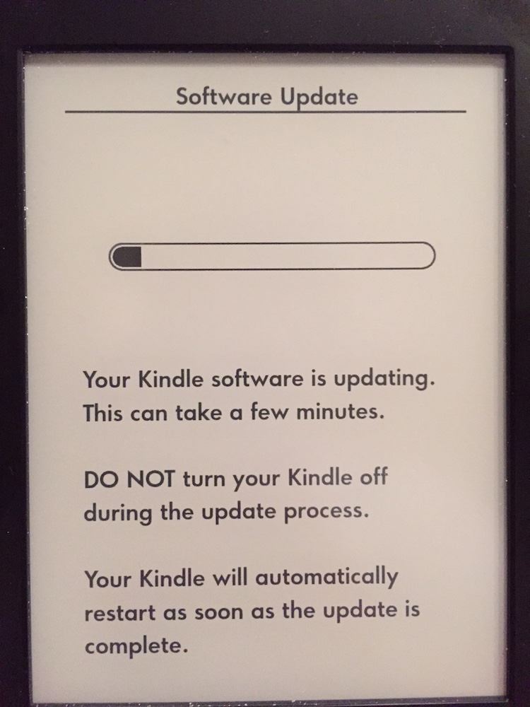
Next disable WiFi on the PaperWhite, because the auto-upgrades will break this functionality. You can enable it again later on, after you’ve added the fonts.
To downgrade the Kindle (in case you need to) follow these steps ;
- Download earlier update file from Amazon: Kindle Paperwhite 1 Update 5.3.1
- Disable wifi on your Paperwhite (airplane mode).
- Connect your Kindle Paperwhite to your computer (do not disconnect until the last step).
- Copy the bin file you downloaded in step 1 to root folder of Paperwhite.
- Wait at least 2 minutes after copy has completed (the devices need to register the .bin internally).
- Push and hold power button until your Paperwhite restarts (the led blinks orange and light turns on at the screen).
- Wait until the Paperwhite has installed the upgrade (which is really a downgrade).
- Now you can DISCONNECT from your computer.
If you’ve done the steps right, the next time the Kindle boots it’ll flash itself from the supplied .bin file.

Once you’re on 5.3.1, getting the fonts activated is pretty easy.
Connect to the device to your PC and do these steps;
- In the root of the Kindle, make a file called “USE_ALT_FONTS” with no content. (
touch USE_ALT_FONTS) - Make a folder called fonts and drop your favourite font in there, in 4 versions each: Regular, Italic, Bold, BoldItalic. The filename needs to include those versions in the suffix, see the example below. I downloaded the ChaparralPro font from Fontzone .
<img src="/wp-content/uploads/2015/05/ChaparralPro_fonts_kindle.png" alt="ChaparralPro_fonts_kindle" width="750" height="121" class="alignnone size-full wp-image-6229" />

  * After you've uploaded the fonts, reboot your Kindle
  * After it booted, go to search in the dashboard/home screen and type `;fc-cache` as a command.
    That forces the Kindle to rebuild its font database. After 4-5 minutes, the device will flash white and reload its UI, that is the sign that the reload finished. Take your time for this.

    The command will look like it completed instantly, but is still running in the background. </ol>

    <img src="/wp-content/uploads/2015/05/kindle-fc-cache.png" alt="kindle-fc-cache" width="750" height="365" class="alignnone size-full wp-image-6227" />

    Once it reboots, you'll find a lot more fonts available in the _Font Selection_ window. Enabling the `USE_ALT_FONTS` flag also unlocks other, already installed, fonts on the device.

    <img src="/wp-content/uploads/2015/05/kindle_unlocked_font_selections.jpg" alt="kindle_unlocked_font_selections" width="750" height="1000" class="alignnone size-full wp-image-6233" />

    After the Kindle booted, I chose the new Chaparral Pro font, increased the font size with 2 options higher than the default and we're good to go.

    <img src="/wp-content/uploads/2015/05/kindle_chaparralpro.jpg" alt="kindle_chaparralpro" width="750" height="1000" class="alignnone size-full wp-image-6234" />

    I'm really happy with the results: the Chaparral Pro font is _very_ pleasing to read.

    Here's a side-by-side comparison of the original, the on-board Palatino and the newly installed Chaparral Pro. Click on the image for a bigger view.

    [<img src="/wp-content/uploads/2015/05/kindle_font_comparison.png" alt="kindle_font_comparison" width="2250" height="750" class="alignnone size-full wp-image-6235" />][9]

    The photo quality is sloppy, as I took "screenshots" with my phone. That means the angle is off every time and the alignment just downright sucks. But it gets the message across.

    I'm hoping the next e-reader I buy has simpler options for managing custom fonts and takes its typography more seriously.