It took a bit longer than I expected but I’m happy to say I’ve migrated this website from WordPress to Hugo and introduced a new layout.
My design philosophy#
I’ll start by saying I’m no designer and have only limited skills with CSS or modern frontend development.
But I do love tinkering and I had a general idea of what I wanted to build. My primary goals were:
- Speed: I want a very fast site
- Recognisable: it can have something unique to it, not just another WordPress theme
- Readability is key: sufficient whitespace & a nice looking font
With those three things in mind, I’m happy with the result. Since there’s always room for improvement, do reach out when you see things I can do better!
Wait, am I a “brand”?#
Something interesting happened when I teased the new design on Twitter. It was still very much unfinished, but a former colleague hit a nerve when he said :
I miss the colors of the banners from your old site. It was always immediately clear that I was on a Mattias page.
What the heck is a Mattias Page?
This got me thinking about the message I wanted to convey to readers and how I position myself online. I started to think of this blog (and my online “presence” 🤮) more as a “brand”, something to pay attention to - not something that randomly happens.
With that in mind, I wanted a recognisable design/layout. I hope to achieve that with the rounded borders in the header. Every sub-category (blog , my projects , …) will keep the same layout idea, but introduce unique colors to give each section its own identity.
I’m probably overthinking things, but it was fun to build & brainstorm about. 😄
Fun fact: the border in the header is pure CSS, using border-radius. No images or SVGs needed!
Consolidating different sites to this one#
Over the years, I’ve started many projects and websites. Each on its own URL and domain name. My idea was to make each a brand that I could promote and market separately.
I’m now moving away from that. It takes too much effort and energy to maintain every brand. Since I introduced a color scheme on this site, I could now bring each project back to this domain.
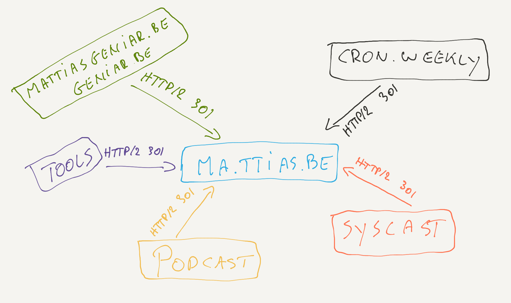
This is still very much a work-in-progress, but all the content from Cron Weekly, the podcast, my old domains, … will be redirected and migrated to this site.
I’m confident this is a good move for the SEO of this site, too.
Speeding things up#
I started this blog in 2008 on WordPress and have been a loyal user ever since. But no more.
All content has now been migrated away from WordPress to Hugo , a static site generator. No more PHP, database or high server load. Every page loads quickly and is served by Caddy .
I was already using static page caching with WordPress, but nothing beats a pure static site. The speed improvements are noticeable.
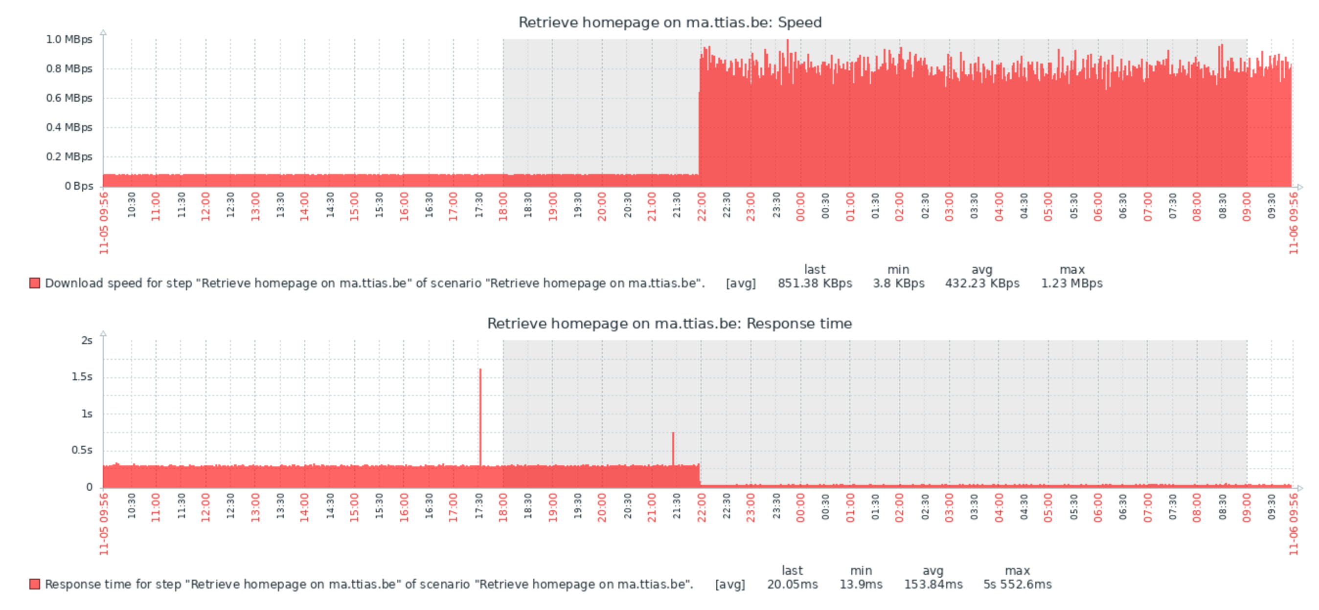
The average response time went from 280ms down to 25ms, that’s a 10x improvement! With it, the download speed went up significantly too.
One improvement I’ll consider, if just for the technical challenge, is to introduce a CDN (or build one myself). Since the site is static, it’s easy to deploy this on a few small servers worldwide and use a DNS provider with GeoIP options to route the user to the nearest server.
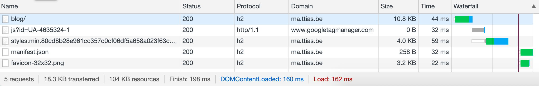
I was also obsessive about keeping the number of network requests to a minimum. If you load the blog overview , you’ll see just 5 HTTP calls.
This was achieved by:
- Dumping webfonts, native fonts (available to your system) only
- Where possible, inline the SVG icons ^((*))
- PurgeCSS to strip the Tailwind CSS framework to a minimum
^((*) Trade-off is that there’s no HTTP caching for those assets, but I’m counting on gzip compression and the fact that SVGs are generally pretty small to make up for that.)
If you’ve ever used WordPress, it’s pretty common to see at least 30+ requests being loaded. Every plugin has some custom CSS or Javascript or loads an additional font/image/asset/… With my new setup, I have everything 100% under control.
Losing the comments#
One major downside to a static site is, of course, that it’s static. No more comments!
I’m not yet sure about that change, I might look into webmentions as an alternative to comments. I won’t use Disqus (too bloated) but I’m open to alternatives. For now, I’ll just point everything to my twitter account for feedback. I realize I’ll alienate some users that aren’t on that platform.
What do you think?#
I think this new site is sort of finished. I’m looking for feedback: do you like it?
If not, what bothers you? What should be improved? Do you spot layout bugs?
You can’t let me know in the comments (there are none 😂) but I’d love to get feedback on Twitter .