I'm a gadget fan. After a few weeks of hesitating (it is expensive, isn't it?) I decided to get myself an Apple Watch. Here's my take on said watch and if I'd recommend it or not.
I bought the 42mm Watch Sport in Space Gray Aluminum . At around 500eur (overseas shipping included) it was the second cheapest Apple Watch. Only the smaller 38mm would have been around 50eur less.
Before you judge me, I’ll admit it right here: that’s an awful lot of money to be spending on a gadget.
Getting the watch in Belgium#
Belgium, where I live, officially isn’t selling the Apple Watch yet. Our neighbouring countries like France, the Netherlands and the UK, do.
I placed my order around 3-4 weeks ago. Back then, I had a choice between France or the UK. Netherlands wasn’t an option yet. I could’ve ordered the watch online in France and pick it up in a store. It probably would have been a ~500km drive. I didn’t do that.
I chose to order the watch in Apple UK and have it shipped to my Borderlinx account. Once it arrived, I used Borderlinx/DHL to ship it over to Belgium. It ended up costing me an additional 40eur in shipping though.
Unboxing#
This is such a nerdy thing to be excited about.
But if you’ve ever gotten something from Apple, it is something that stands out. The packaging is amazing. The attention to detail really stands out.
The Apple Watch Sport comes in a rectangular box. If you order the Apple Watch (not the sport), the packaging is different.
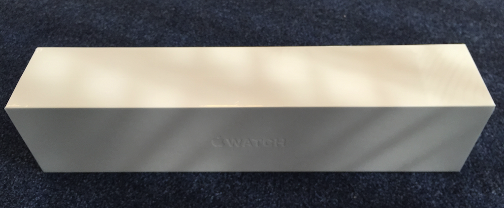
Once opened, you’re greeted with yet another box, with 2 handy pull-out strings to the sides.
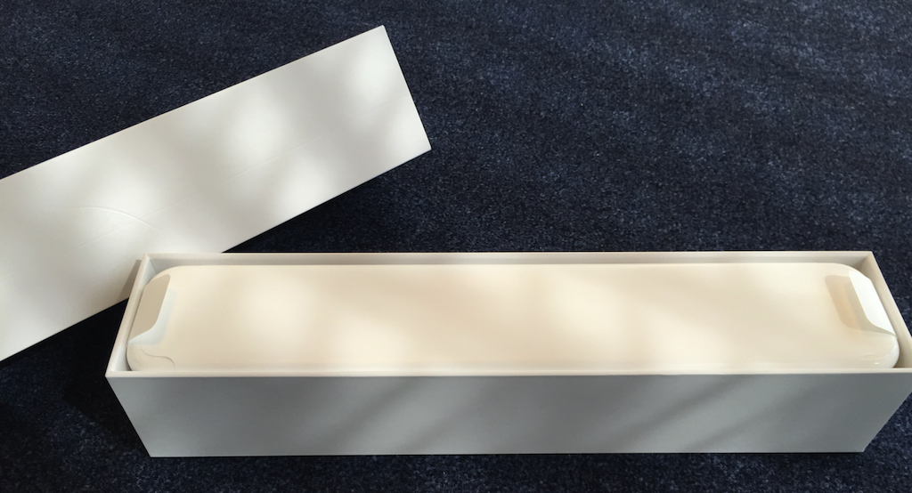
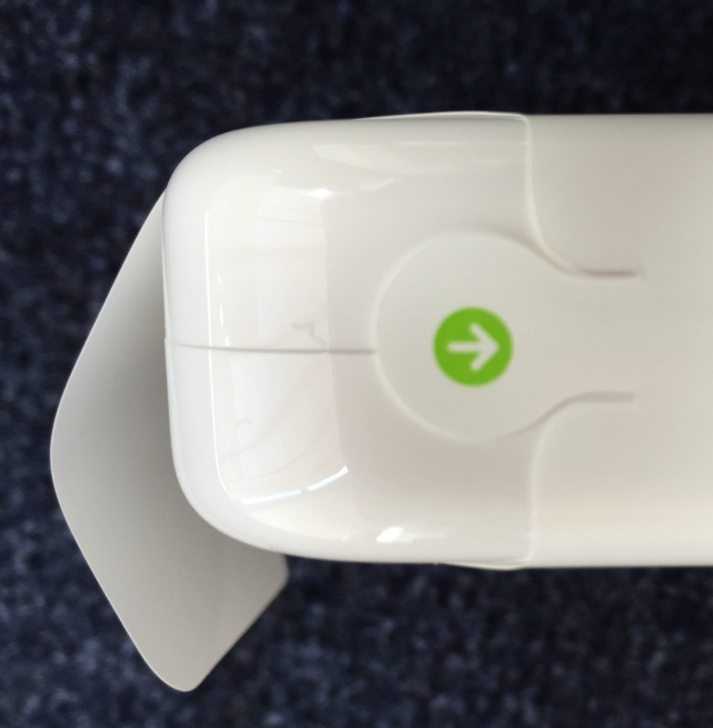
The box that comes out of it has a simple pull-string to remove the plastic surrounding it.
Inside, the Watch is displayed with the default strap.
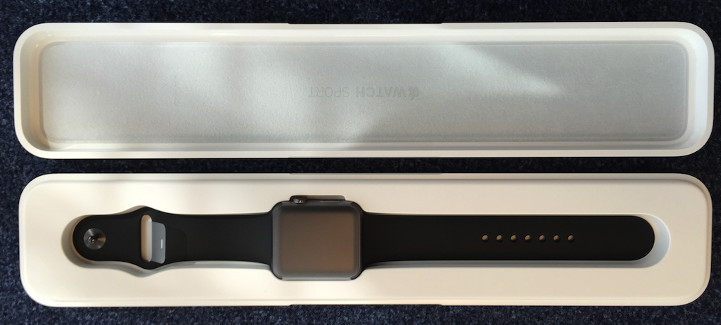
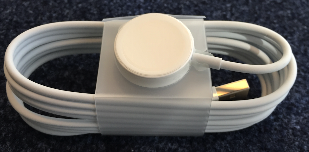
Underneath the Watch are the accessories: the charging cable and plug.

Below that, an additional strap is included. It’s slightly shorter than the one it comes attached with, in case you have smaller wrists.

Charging happens via induction. The Watch magnetically clicks to the charger. There’s no USB or cable directly attached to the Watch.
Starting & Syncing#
The Watch works via bluetooth low energy, so it needs pairing with your iPhone. Traditional bluetooth pairing uses a 4-digit key code you enter on both devices to pair.
It doesn’t quite work that way on the Watch. The pairing is best compared to a QR-code. You scan the watch with your phone, after which the pairing succeeds. The visuals included in the process are a stunning high-res pixel explosion.
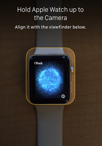
Once the sync is completed, the phone will start to sync your current Watch Compatible apps over to the Watch.
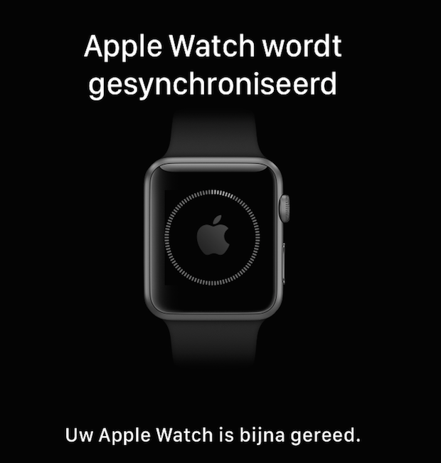
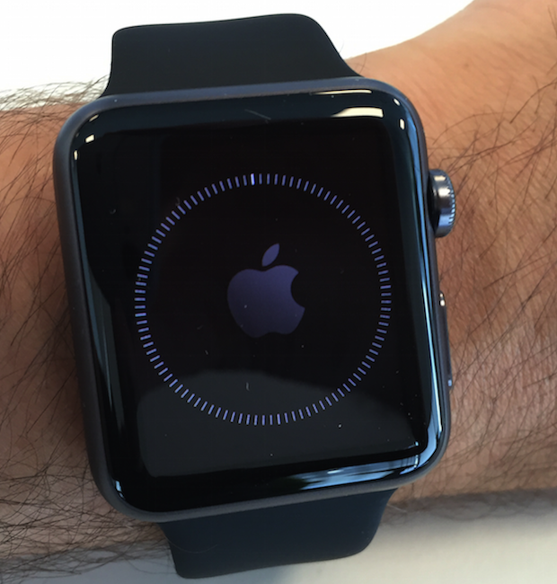
The animations on the Watch and the iPhone app are kept in perfect sync. It’s these details that make the difference.
This process took longer than I would have thought. The Watch was easily syncing for 4-5 minutes.
Watchfaces#
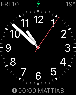
A couple of the podcasts I listen to all mentioned they were using the Utility watch face (like the ATP folks ). I admit, it’s a very nice watch face. It has sufficient options to reduce the details on-screen and choose your custom complications, the little widgets shown on the watch in the corners and bottom.
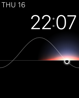
I changed to the Solar watch face for a few days, because I liked the simplicity of it. Just a clock and a nice HD animation of the sunset and sundown.
I eventually swapped it out for the Modular watch face, which I’m still using now. The lack of complications on the Solar watch face was a deal breaker.
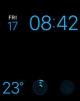
It’s super convenient to have a couple of complications on-screen: date, temperature and the activity tracking rings.
Time to stand!#
If enabled, every hour the watch will tap you slightly and motivate you to take a small walk. Stretch those legs a bit.
It’s a fun feature. I’m not sure if I’ll still obey the watch after our gadget-honeymoon period, but for now it’s a cool novelty that gets me to stand up a little more during the day.
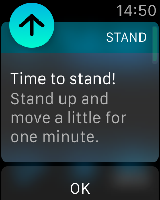
The only downside: if you’re taking a nap during the day, this’ll tap your wrist and will probably wake you.
Taps, taps and taps#
Among nerds, it’s pretty well known that the Apple Watch doesn’t vibrate on notifications, it taps.
It isn’t just a marketing term, it actually feels like a tap. Definitely not a vibration on the watch, more of a gentle nudge.
Which brings me to the downside of taps vs. vibrations: they can go by unnoticed.
There’s an option called Prominent Haptic Feedback on the watch. It’ll tap you an additional time on notifications.
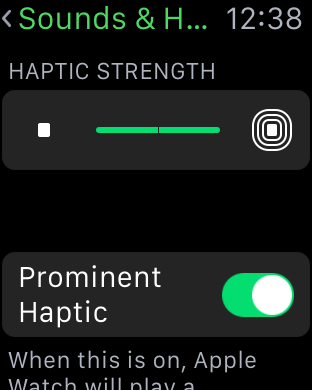
Even with that option, I keep missing taps. I feel a vibrating watch would probably have caught my attention better.
While it certainly isn’t the end of the world to miss a few notifications, it is inconvenient. And in a job where being on-call means responding to text alerts and push notifications, it can be annoying.
Watch vs. Phone#
The Watch needs the Phone to work. It’s standalone functions are extremely limiting.
Yet while the watch needs the phone, I notice I am using the phone less. I’m less distracted.
We’ve all done the routing where we get a notification on the phone, check it out, open a completely unrelated app (out of reflex, automation, …) and start browsing the web or reading tweets. Once the phone gets my attention, it keeps my attention.
Since the watch is such a limited device in terms of input, it’s mostly a read-only device to me. I read my notifications, perhaps answer with some canned responses or dictated message. But I won’t go reading the news on it. Or opening Twitter. Or read all my mails.
It’s strange how a device with less features than the phone managed to reduce my time on the phone.
Hey Siri, …#
The only means of input on the watch is via dictation. That means you talk to Siri.
I’ll be honest: I still feel like a complete douchebag when I’m talking to Siri and dictating text or a command. I’ll never do this in public or in front of others.
It is convenient when I’m in the car or when I’m alone. In all other circumstances, I’ll actively try avoid using it.
Other than that, I find Siri dictation to get my input right around 75% of the time. Other times it just completely fails to work or misinterprets my voice entirely. A 75% success ratio is terrible if it’s your only means of giving input.
Battery Life#
Not an issue, at all.
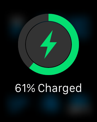
After a full day of usage, I never got it below 60% battery when I went to sleep.
If you want to use it as a sleep tracking device, it’ll surely survive a 24 hour period. You can charge it during the day or on your commute to work.
Apps#
There aren’t a lot of apps I use on the device. Here are the ones that stand out to me.
- Remote: it feels very SciFi to control your Apple TV via your Apple Watch. No more remote controls, just browsing Netflix via the Watch.
- Yahoo Weather: an improved weather app with convenient icons and info.
- Activity Tracker: the built-in app, for now it’s keeping me on the move more often, so we’re still happy together.
- Overcast: simple podcast skipping/playing via the Watch.
- Workout: more tailored towards actual sports than the Activity Tracker, does more accurate heart rate tracking and can set goals to achieve.
- Notifications: while not a real app, it is my most used feature. All notifications on the phone get replicated on the watch.
I’m curious what watchOS 2.0 will bring in terms of additional functionality.
The 2.0#
Speaking of new releases, I’m wondering if Apple will launch version 2.0 of the Watch hardware anytime soon.
The iPhone cycle is very clear: every 2 years there’s a new model, every other year the current model gets an internal hardware upgrade.
To me, the Watch has sufficiently strong hardware: retina/HD display, it’s responsive enough, the touchscreen works flawlessly, …
Apple has an obsession with the thinness of their devices. At each iteration, they’ll attempt to make it more thin. I suspect that’s what’ll happen to the watch as well. There’s no need for a faster CPU or more memory, but the next version will be thinner. And at time I’ll look at this watch and realise how bulky it looks.
Even though at this point, the watch doesn’t feel heavy or thick, at all.
Managing calls#
One of the most useful features, to me, is being able to identify a caller without looking at your phone. The phone is usually buried somewhere in a jeans pocket and it isn’t always convenient to take it out.
The watch instantly shows you who’s calling. You can even answer the call on the watch, quietly walk to your phone and resume the call there via handoff.
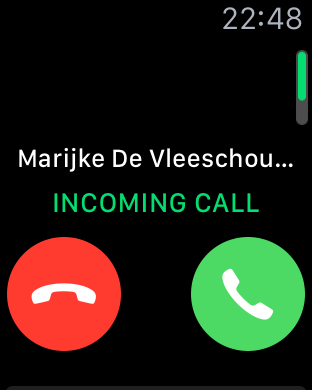
If you scroll down on the watch during a call, you get the pick some canned responses to answer. You don’t need to look at your phone anymore.
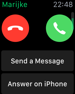
The “answer on the phone” option will answer the call and place it in a sort of “hold” state, until you can get to your phone and resume the call, in case you don’t like talking to your Watch like inspector gadget .
This kind of detachment from my phone has changed how I keep my phone with me. Now, I can more easily let the phone lay in my nightstand or in the kitchen, and comfortably walk around knowing I can still receive calls and be alerted of text messages.
Until the Watch, I anxiously kept my phone with me at all times, for the fear of missing out .
Conclusion: Expensive Gadget#
After a one week usage, I can conclude what I had expected when buying the Apple Watch: it’s an expensive gadget that’s really fun to play with.
The Watch keeps me focussed more, with less time spent on my phone. Notifications are very convenient to have on your wrist. The sport/activity tracking motivates me to get up and walk.
It’s functionality is limited though. It’s a watch, but not a smart watch per sé. I look forward to the Google Now alternative from Apple. I believe the Watch has everything available to become a really powerful platform and a great extension to your phone.
Would I recommend you get a watch? If you like gadgets, appreciate the Apple ecosystem and have some money to spare, then yes: get one.
If you just have an iPhone, the Watch probably doesn’t offer that much additional benefit. If you’re heavily invested in the Apple ecosystem (Apple TV, Airplay, Mac, iPhone, iPad, …), the Watch has more to offer since it interacts with each of those devices flawlessly.
If you’re looking for a brutally honest Apple Watch review, I highly recommend The Oatmeal’s “8 things I learned from wearing an Apple Watch for a couple of weeks” .