Out with the old, in with the new!
After a couple of years I felt it was time for a refresh of the design of this blog. It’s already been through a lot of iterations, as it usually goes with WordPress websites. It’s so easy to download and install a theme you can practically switch every day.
But the downside of WordPress themes is also obvious: you’re running the same website as thousands of others.
Not this time, though.
Ps; if you’re reading this in your RSS feed or mailclient, consider clicking through to the website to see the actual results.
Custom theme & design#
This time, I decided to do do it myself. Well, sort of. The layout is based on the bootstrap CSS framework by Twitter. The design is inspired by Troy Hunt’s site. Everything else I hand-crafted with varying degrees of success .
In the end, it’s a WordPress theme that started out like this.
<?php

?>
Pretty empty.
Focus on the content#
The previous design was chosen with a single goal in mind: maximise advertisement revenue. There were distinct locations for Google AdSense banners in the sidebar and on the top.
This time, I’m doing things differently: fuck ads.
I’m throwing away around 1.000eur per year in advertisement revenue, but what I’m gaining is more valuable to me: peace of mind. Knowing there are ads influences your writing and topic selection. You’re all about the pageviews. More views = more money. You chose link-bait titles. You write as quickly as you can just to get the exclusive of a story, not always for the better.
So from now on, it’s a much more simple layout: content comes first. No more ads. No more bloat.
Speed improvements#
The previous site was – rather embarrassingly – loading over 100 resources on every pageview. From CSS to JavaScript to images to remote trackers to … well, everything.

The old design: 110 requests with a total of 1.7MB of content. The page took more than 2 seconds to fully render.
With this new design, I focussed on getting as few requests as possible. And I think it worked.

Most pages load with 14 HTTP requests for a total of ~300KB. It also renders a lot faster.
There are still some requests being made that I’d like to get rid of, but they’re well hidden inside plugins I use – even though I don’t need their CSS files.
A lot of the improvements came from not including the default Facebook & Twitter widgets but working with the Font Awesome icon set to render the same buttons & links, without 3rd party tools.
Social links#
I used to embed the Twitter _follow _& Facebook share buttons on the site. It had a classic “like this page” at the right column. But those are loaded from a Twitter/Facebook domain and do all sorts of JavaScript and AJAX calls in the background, all slowing down the site.
Not to mention the tracking: just by including those pieces of JavaScript I made every visitor involuntarily give their browsing habbits to those players, all for their advertisement gains. No more.
To promote my social media, you can now find all necessary links in the top right corner – in pure CSS.
Want to share a page on social media? Those links are embedded in the bottom, also in CSS.

While the main motivator was speed and reducing the number of HTTP requests, not exposing my visitors to tracking they didn’t ask for feels like a good move.
Why no static site generator?#
If I’m going for speed, why didn’t I pick a static site generator like Jeckyll , Hugo , or Octopress ?
My biggest concern were comments.
With a statically generated site, I would have to embed some kind of 3rd party comment system like Disqus . I’m not a big fan for a couple of reasons:
- Another 3rd party JavaScript/AJAX call that can be used for tracking
- Comments are no longer a “part of” the website, in terms of SEO
- I want to “own” the data: if all comments are moved to Disqus and they suddently disappear, I’ve lost a valuable part of this website
So, no static generator for me.
I do however combine WordPress with a static HTML plugin (similar to Wordfence ). For most visitors, this should feel like a static HTML page with fast response times. It also helps me against large traffic spikes so my server doesn’t collapse.
Typography#
I’m a bit of a font-geek . I was a fan of _webfonts _for all the freedom they offered, but I’m taking a step back now to focus on speed. You see, webfonts are rather slow.
An average webfont that isn’t in the browser cache takes about 150-300ms to load. All that for some typography? Doesn’t seem worth it.
Now I’m following Github’s font choice.
font-family: -apple-system, BlinkMacSystemFont, "Segoe UI", Roboto, Helvetica, Arial, sans-serif, "Apple Color Emoji", "Segoe UI Emoji", "Segoe UI Symbol";
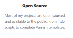
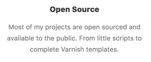
In short: it takes the OS default wherever possible. This site will look slightly different on Mac OSX vs Windows.
For Windows, it looks like this.

And for Mac OSX:

Despite being a Linux and open source focussed blog, hardly any of my visitors use a Linux operating system – so I’ve decided to ignore those special fonts for now.
Having said that, I do still use the Font Awesome webfonts for all the icons and glyphs you see. In terms of speed, I found it to be faster & more responsive to load a single webfont than to load multiple images and icons. And since I’m no frontend-guru, sprites aren’t my thing.
Large, per-post cover images#
This post has a cover image at the very top that’s unique to this post. I now have the ability to give each post (or page) a unique feeling and design, just by modifying the cover image.
For most of my post categories I have sane defaults in case older posts don’t have a custom header image. I like this approach, as it gives a sense of familiarity to each post. For instance, have a look at the design of these pages;
- Increase A VMware Disk Size (VMDK) Formatted As Linux LVM without rebooting
- PHP Session Locking: How To Prevent Sessions Blocking in PHP requests
- Increase/Expand an XFS Filesystem in RHEL 7 / CentOS 7
I like how the design can be changed for each post.
At the same time, I’m sacrificing a bit of my identity. All my previous layouts all had the same theme for each page, causing – hopefully – a sense of familiarity and known-ground. I’ll have to see how this goes.
There’s a homepage#
This blog has always been a blog, pur sang. Nothing more.
But as of today, there is an actual homepage ! One that doesn’t just list the latest blogposts.
I figured it was time for some kind of persona building and having a homepage to showcase relevant projects or activities might persuade more visitors to keep up with my online activities (aka: Twitter followers).
Feedback appreciated!#
I’m happy with the current layout, but I want to hear from you want you think: is it better or worse?
There are a couple of things I’m considering but haven’t quite decided on yet:
- related posts: should they be shown below every post? They clutter the UI and I don’t think anyone ever bothers clicking through?
- cronweekly/syscast “advertisements”: the previous layout had a big – but ugly – call-to-action for every visitor to sign up for cron.weekly or check out the SysCast podcast . Those are missing now, I’m not yet sure if – and how – they should return.
If there are pages that need some additional markup, I’m all ears. Ping me on Twitter with a link!